5 Minute Overview
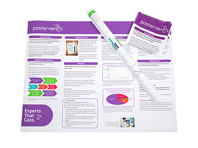
At its core, a scientific poster is a visual representation of data that has been organized and consolidated into an easily-digestible format. A good poster should be able to be understood in a few minutes, so it’s of the utmost importance to make sure your poster is logical, consistent, and designed well.
Sections and Organization
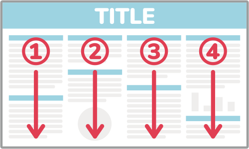
It’s easiest to break down all the information you want into distinct sections, such as Background, Objectives, Methodology, Results, and Recommendations. A typical poster will have 4-8 of these sections laid out in 3 or 4 columns, but the specifics of your research will dictate which sections are important to include. Posters are read from left-to-right and top-to-bottom, so make sure to lay out your sections so they can be read in order.
We have many free scientific poster templates to get you started, and you can also check if your school or organization has a standard template they can provide you. Otherwise, you can come up with your own layout for your information.
Design Guidelines
When it comes to design, there are a few basic rules to follow:
Simple is Good
Your background should be plain white or a very subtle gradient/pattern that is not distracting and your text should be clear and easy to read. Any charts or graphics should be able to be understood quickly and not include unnecessary elements.
Make Important Information Stand Out
Section headings should be obvious and important research should draw attention.
Line Things Up
Try to fit everything to a basic grid and align each section with another. If you have a set of charts or photos, it looks best to have them equally-sized and distributed evenly.
Don't Make it Crowded
A viewer may only spend a minute or two looking at your poster so they should immediately be able to make sense of the organization and be able to identify the distinct sections.
Final Check
Before giving us your poster to print, it’s helpful to do one last check of everything to make sure your poster will look as good as possible. Here are 5 questions to answer:
- 1 Do my poster sections flow logically? The sections of your poster should be organized and follow the general structure of introduction → data → conclusion.
- 2 Is all my text readable? All the text on your poster should stand out against its background, use a legible font, and be large enough to be read from a reasonable distance. Also, check for spelling mistakes!
- 3 Are all my graphics good quality? Zoom in on your file to 100% and make sure all photos, charts, and illustrations look clear and crisp. (If you are going to be ordering a poster that is larger than your file, zoom in farther).
- 4 Is my data understandable? All your tables, charts, and graphs should be able to be looked at and understood in a few seconds.
- 5 Does the most important information stand out? When skimming over your poster, the most important parts should catch your eye and be very obvious. If someone reads your poster for a minute or so, they should be able to fully understand your presentation.
Questions, Comments, or Concerns
If you have any further questions or comments about our tutorials, we would love to help you out.